top of page

Design & Creative Direction
Microsoft Family Safety
Storytelling, 3D Design, Art Direction
Credits
Creative Direction –
Nando Costa & Rachel Romano
Art Direction & 3D Design – Alexis Copeland
Microsoft Family Safety is an app that protects the ones you love with digital and physical safety features. The app hopes to provide families with more peace of mind.
To commemorate the app's release, I created a variety of images for storytelling and product that helped influence the app's overall brand and marketing.
To share the product design team's learnings, obstacles, and successes with the creation of the new app, this collection of imagery represents those that were created for its design article.
(Above) is a pack shot showcasing the experience across multiple platforms within a children's room. The design extracts the essence of the experience into dimensional space, such as the app's map that helps you locate your family members. Among my favorite though, was featuring one of my favorite tiny creatives, Elsa Costa's artwork. (The charming sheep unicorn creature) 🦄
Additional support imagery aimed to capture a glimpse into the iterative design process, such color palette design, type ramps, UI/UX components, among much more. Another central theme across the app creation was inclusive visual designs that felt friendly and emotive. We represented these values by creating a family that was different than "traditional" nuclear family. Here you see a multi–generational and multi–cultural family, across many shapes and sizes.
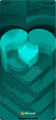
To strenghten the connection between storytelling and product, we used the dimensional map object as a bacground for the app's sign in experience. Seen below.
Lastly as a visual experiment, I created a seperate project to remix the above designs into a more immersive space, inspired from app's icon and color palette. Here the icon takes a more sculptural role and could be used as a props or elements of a set design for future branding opportunities.
bottom of page


